me rambling abt character design or whatever
idk if anyone cares but personally i find peoples thought process when making characters very interesting. and i never rlly got a chance to talk abt it in depth cause i dont like uhh "breaking character" if you can call it that, so i probably wont put this anywhere easily noticeable on the website. character design is actually one of my biggest passions lmao altho im aware most of them just look like something an edgy teen scribbled in their notebook (because thats literally what happened). uhm big text i didnt grammar check... so..yknow
morti:
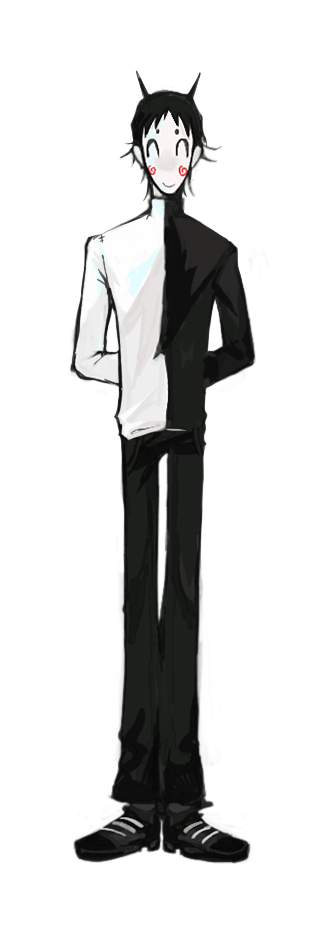 morti is one of the, if not THE oldest/first design i ever made for this universe and didnt change a whole lot. mainly he used to look a lot more jester-ish especially his outfit but he always had the same face, hair and color palette. i think its interesting how people interpret his looks differently ive heard some think hes some sort of clown or that he reminds him of the batter from OFF. wich are both understandable, i can see it. but he’s mainly based of the Cheshire cat, old black and white cartoons (thats where the ink comes from) and i just wanted a character with very big black eyes. he also has grim reaper stuff going on like his scythe. his job is purgatorial soul conductor , so basically whelcoming the dead into the afterlife. there was this theory about alice in wonderland that was basically "alice died when she fell down the hole and the wonderland is the afterlife" so thats where my cheshire cat inspiration came from. talking about his design is kind of a spoiler lol but fuck it, its gonna be forever till a gamer ever comes out so whatever. mortis character and appearance is themed around death in general. i mean come on... his name is MORTI - mortis is latin for death. and the song on his character wiki is literally "danse macabre" lol. hes pale like a corpse. Decomposition of the gastrointestinal tract results in a dark liquid coming out of the corpses mouth and nose. the colors black and white widely represent life and death. hehe its very obvious once you think about it. i also wanted his face to be mask like so its hard to read his intentions wich leads to him often being misunderstood by people.
andrew:
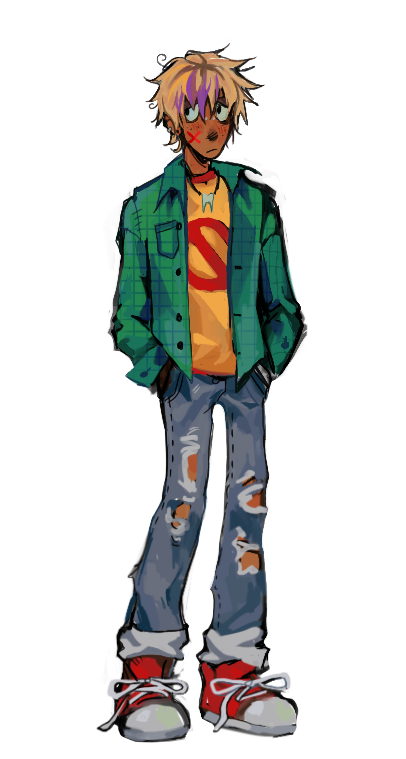 his design is something i just came up with on the run when i was drawing the original comic i was like "fuck i need a protagonist uhhh blonde guy with a purple streak in his hair and piercings". if i knew how much i would expand on that story i wouldve put some more thought into it lol. but it works for him ig cause his whole point is being "literally just some guy". i wanted him to look like someone you could hang out with and just chill. hes based of that Fry from Futurama character archetype but with a bit more going on than just trying to get a girl out of his league for the entire runtime of the show lol. a lottt of anime have that brown haired protagonist whose as bland as they come so viewers can selfinsert and project onto them, but i never related to those guys cause theyre just so LAME. so i tried to make someone who would be relatable and you could see yourself being in his place but who also has a personality. idk if i succeeded with that but he seems to be quite popular lol. yea and his outfit reflects that he looks very normal, like your average grunge guy you meet at college or wherever . also hes one of the only characters with a warm color palette to contrast with the rest
isaac:
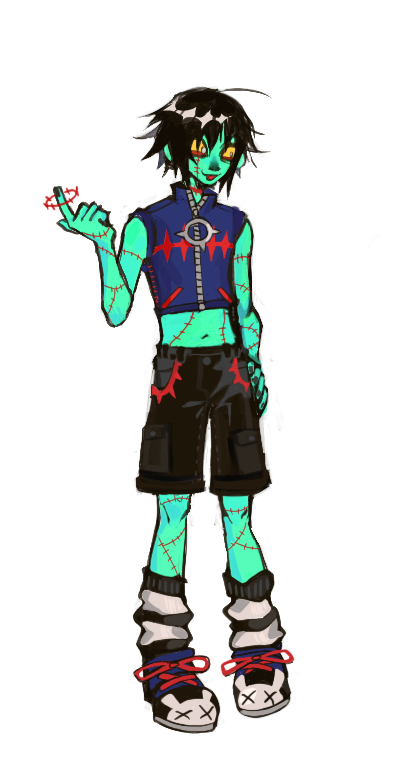 out of the main characters he changed the most over time. he used to look like just some random lol WAY less radio active. i often have designs for characters i keep recycling over and over again and back in the day i had a human au version of an old DnD NPC called ash, he was very pale and had black hair, grey eyes and a blue turtleneck sweatshirt with a zipper at the top. and well- that was basically Isaacs grandpa lol. i kept changing small things about it till someday i created beta-isaac. he also had pale skin, black hair, grey eyes and that sweater but he was wearing bunny slippers and black amd white striped pants, his hairstyle was more similar to his current version and he had a jester hat for some reason??? idk i was very much into clowns back then. well i scapped the hat and there was original boring isaac from the comic. wow. later on i made him green wich was sort of by accident. (i drew him with a limited color palette and had to use a murky green for his skin and ended up liking it) so then he had arguably his most cursed phase. swamp isaac. his skin was the most disgusting fucking green i had ever layed eyes on and i deleted all the art from it and act like it never happened. then i redesigned him AGAIN and thats that. better outfit, nice bright green skin and longer hair and more red stitches. why all the bunny imagery? it has to to with his backstory...so also spoilers kinda but not if youve read the websites deep lore lol. the german equivalent to the word "lab rat" is "versuchskaninchen" wich translates to test-bunny and thats literally what isaac was a child. and they had many rabbits to do tests on at that hospital wich he liked to play with. so yea thats why he really really likes bunnies also theyre just cute.
olive:
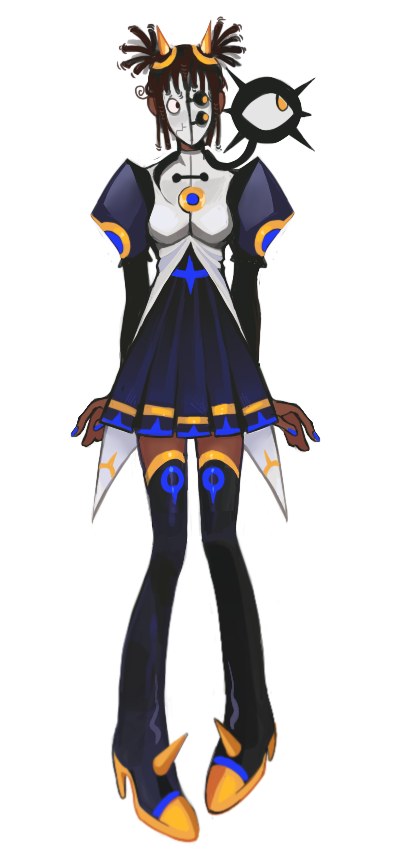 olives design is one of my favorites but it doesnt have any interesting stories. i just thought it would be funny to have someone who looks like an intimidating demon but is actually just an awkward cosplayer. so her older design looked a lot more hand made and less cool. her current alteration went through a lot of small changes for example going from a long dress to a skirt but nothing too crazy. shes supposed to have sort of a secretary type look and her mask is supposed to resemble notebook paper. since a human living in hell with a fake identity so you know i wanted the mask to look very emotionless and only have very few human features. you know now that im thinking about it its pretty funny, cause shes autistic and shes quite literally "masking" in public lolll that wasnt even intentional.
marisol:
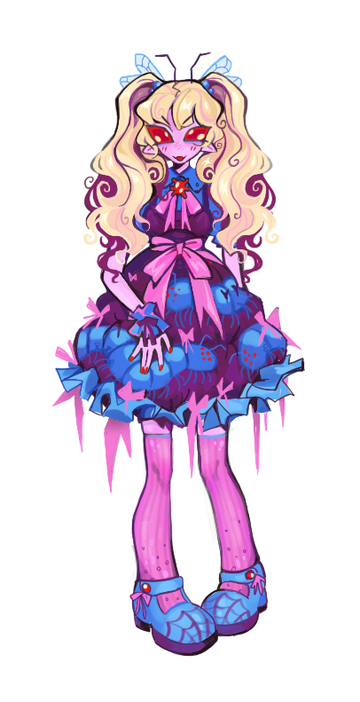 honestly i just really like the bug lolita trope heh. i also wanted her to complement olives design, black and pink akways looks good together and they both have pigtails most of the time. and her cutesy looks contrast with her aggressive personality contrary to olive who has a more spikey dark outfit but is actually very sweet. olives silhouette is more tall and sharp and maris is more short and rounded so they look cute next to each other. wich in a way also reflects their codependent relationship lol. also idk if this makes sense but visually marisol looks cute and innocent from the outside but underneath she’s a bug monster but personality wise its the opposite: from the outside shes mean and violent but from the inside shes just a victim of circumstance and just wants to be seen and appreciated. thought that was kinda interesting
about the other characters, there isnt a lot to say about their designs because i made them mostly just from a visual standpoint. so they look cool and fit their personalities and the creation was pretty linear with minimal redesigns (except for 19 of course,i made him drink the anti-slut potion). im always interested to hear your thoughts tho
go back?